Ever since we moved in, I’ve been scheming and dreaming of ways to decorate B’s big girl room. I wanted it to reflect her personality with lots of color and unique details. I love how it turned out, specifically with the wallpaper from Loomwell that I think completes the room.
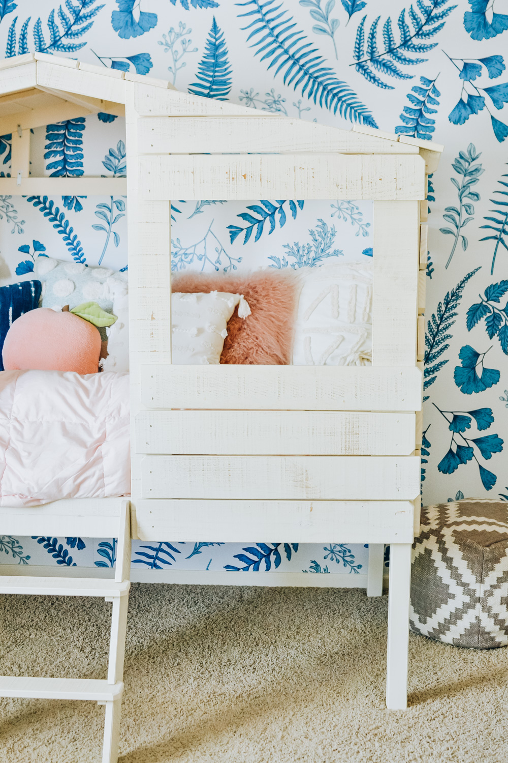
We started by choosing the bed first from Wichita Furniture & Mattress. I loved the treehouse bed because it seemed cozy like her crib, but was really unique and fun for a big kid room. It immediately reminded me of the book “A Tree Grows in Brooklyn,” which was exciting because we’ve always tried to incorporate some elements of New York in Brooklyn’s room just because of her name. New York has always held a special place in my heart, too, for no particular reason other than I just love it there. The art, food, sights, and history are just spectacular. I’ve also read the book a few times, and used it as a loose jumping off point. Overall, I wanted B’s room to be a little vintage, super playful, and cozy.
The removable wallpaper came from Loomwell, and I knew their Ash wallpaper design would be amazing behind the treehouse bed. It’s got a vintage vibe, but is also totally updated and modern. Plus, adding a big pop of blue with the Ash wallpaper took me out of the neutral + pink only scheme we’d been working with so far. I loved the challenge of bringing that color into the rest of the room, and it added such a whimsical feel after it was installed.
My husband did an awesome job of installing the wallpaper - we used the same company in B’s nursery at our old house, and were thrilled that it was so easy to take down (bittersweet for sure) when it was time to move. It was easy to convince Jordan that a removable wallpaper would be ideal after we saw how well it worked at the last house! A few other things to note: The print quality and feel of the paper is stellar. We have a super light wall texture in B’s room, and this held nicely on her wall. Obviously samples are highly suggested to test this in your own home, but Loomwell’s wallpaper self-adhesive does well with lightly textured walls according to their FAQ page.
I ended up painting all of the artwork in B’s new room to A.) Save money & B.) Have full creative control. It was a lot easier to stay within the theme and color scheme this way! I thought the apple and pigeon were a fun ode to NYC, and they were SO fun to paint. I was really inspired by the brand Oeuf NYC and pictures of the founders’ Brooklyn Brownstone (linked here if you’re curious). We’ve named the pigeon “Bernice” after Bert’s pigeon on Sesame Street. She’s got a lot of confidence rocking that beret, and I dig her sassy sweater.
The rest of our house isn’t nearly as playful or colorful as B’s room, so this was really a place for me to let loose. My childhood bedroom growing up was also really bright and fun, and I think it’s so important that kid spaces foster imagination and creativity. That being said, we keep the majority of her toys downstairs for now, and are really trying to drive home that her bed is for “night night time only” to promote better sleep habits. It’s gone well so far - fingers crossed, knock on wood ;). As she gets older, it’ll be fun to watch this room evolve with her.
B’s room in our old house had a lot of modern pieces, but this time I wanted to bring in more character with pieces like a vintage rug and wooden toys. I even found an antique copy of “A Tree Grows in Brooklyn” on eBay! I love how much richness and interest these old pieces add to her room. There’s a touch of history to each one, and it’s like they’re bringing their own little bits of wisdom and magic into her world.
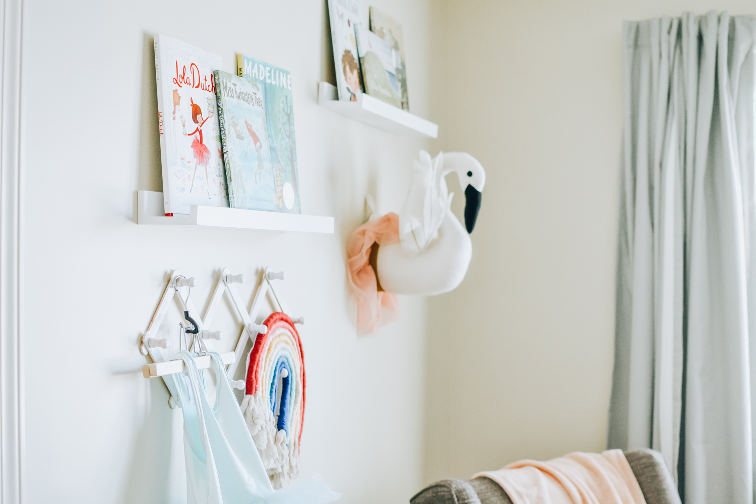
I think the key to making a kid’s room feel “designed” without being stuffy is bringing in more grown-up pieces (such as throw pillows, rugs, and baskets from the non-kid part of the store) to mix in with quirkier and more playful elements (vintage toys, pom-pom throw blankets, funky art prints, and children’s books as decor). I love that trends like the boho look work so well with kids’ rooms too! I shopped a lot of places like Anthropologie, Urban Outfitters, and Target’s Opalhouse line for pillows, throws, and decor (all link details at the bottom of the post!)
I may have gone overboard with the pillows, but that’s nothing new for me! The shape of the bed and the way it sits in the room reminded me of a day bed, hence the overkill on pillows. I’ve linked all those beauties below (minus the pom pom pillows - those are both sold out now sadly so I found a similar one from Anthro):
We kept her little rocking chair and reading corner the same, with the addition of a magazine rack my grandpa made that I painted pink to match the room. I love that the books literally surround her chair. The books I have on display are linked below!
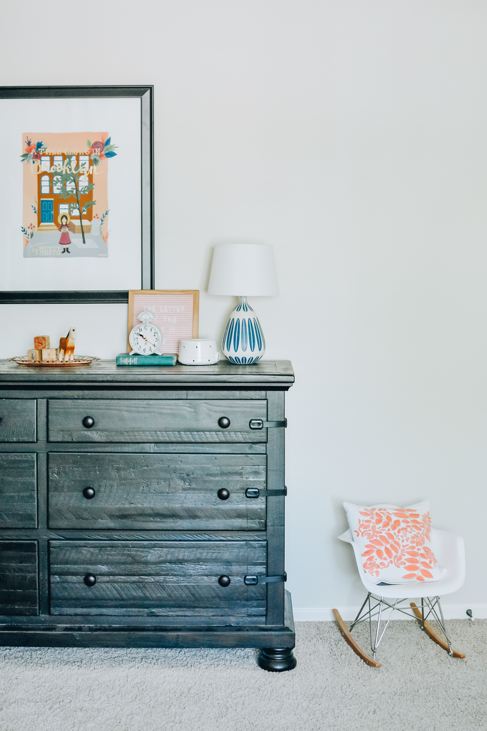
I’m sorry in advance that a lot of this furniture isn’t linkable! B’s treehouse bed is on display at Wichita Furniture & Mattress if you’re local (along with some awesome other kids furniture!), and we ordered her dresser and rocking chair 3 years ago when we did her nursery. Her pale pink comforter is also not online, but it’s from our local (family-owned!) Ashley Homestore, and we love how light and cozy it is. I’ve linked similar pieces below for anything that’s vintage, custom, or discontinued. Thank you as always for supporting the blog by shopping with my affiliate links!


