Dining Room
I'm totally kicking myself right now because there are zero pictures I can show you of our dining room "before." I'll set the scene for you: Beige patterned wallpaper, Marie Antoinette curtains, a wall of mirrors, and stained glass upper cabinets. Things that I loved about this room regardless: Window seat, lots of space, built-in buffet server, and a perfect spot in the layout of the house.
My husband and I love to entertain guests. It was so important to us that we had a place for people to gather, and we needed a dining room that felt like it was part of the house without being totally sectioned off from everything. And since this room is right off the entrance, it's a first-impression room. It needed to be warm, inviting, and encapsulate our house's feel at first glance. #NOPRESSURE
I'll admit, the first few months after this room was 90% put-together, something felt totally off to me - like it just wasn't quite right yet. Our overall color scheme in the house is gray, white, and black. We've slowly been finding pieces that introduce color, but it's difficult to walk that balance between just enough color and under/overdoing it. But because this room needs to be welcoming of guests, it seriously needed a splash of color. When we redid the decor on the deck, I introduced some blue into a very neutral space, and it was the perfect color addition. In the name of consistency, I decided to play that same card again in this room.
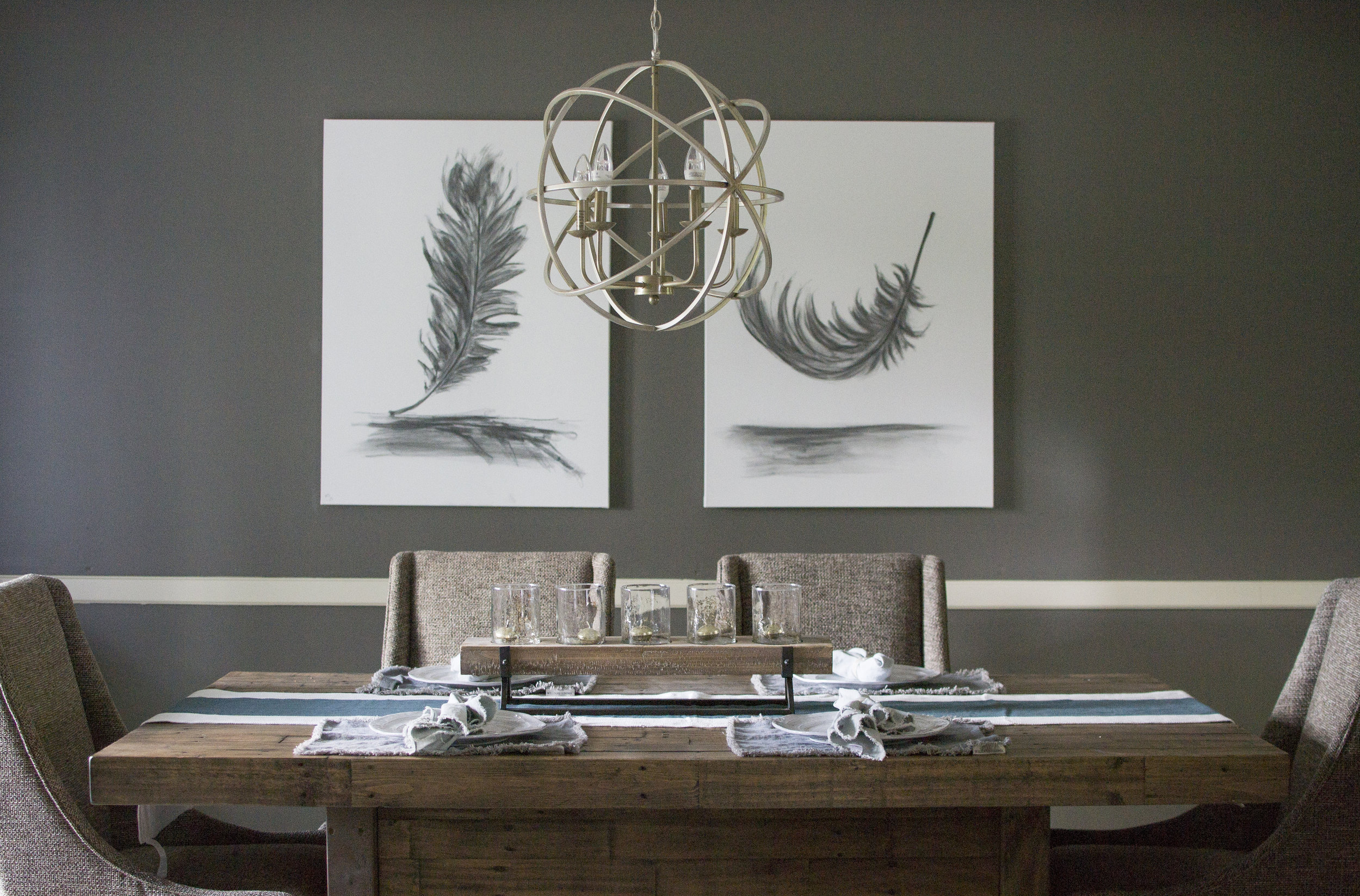
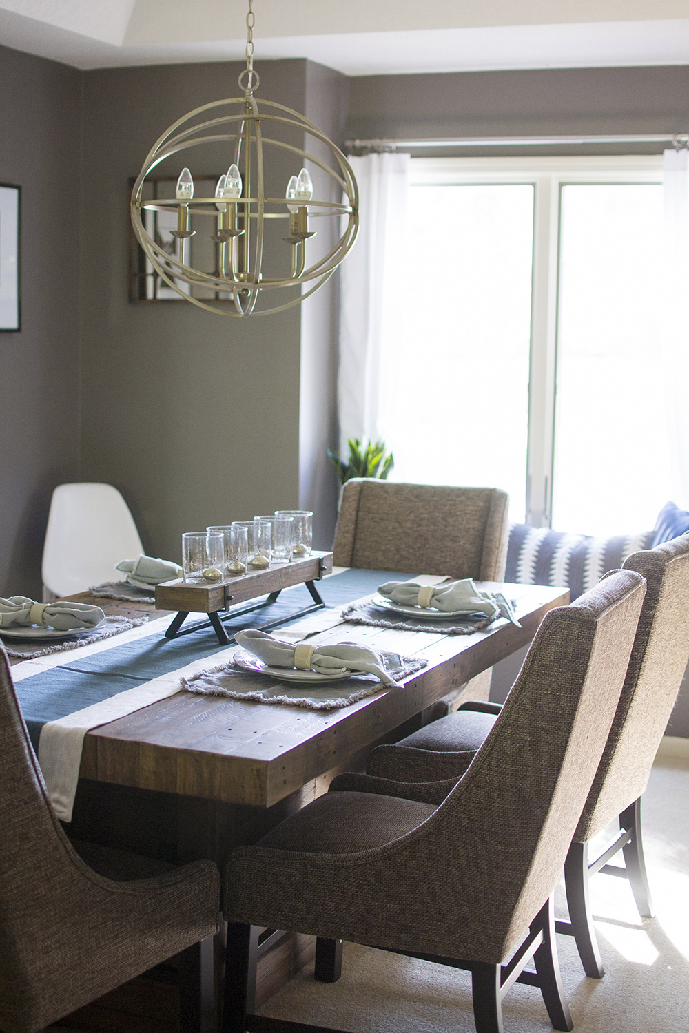
The walls in the dining room are a darker gray (SW Gauntlet Gray), which we loved since it added a little intensity and personality to the room. We also chose a very rustic dining set, with cozy chairs and a bench, so my biggest challenge was keeping the decor modern, not farmhouse, since the furniture could swing either way. I'm really happy with the combination of charcoal drawings, vintage Mudcloth pillows, mid-century modern planter, and a touch of deep blue. This was a tricky room to get right, but it's now one of my absolute favorites in the house. The details in blue really are my favorite part of this room.
Lest you think I have nothing but sweet, sweet time on my hands, I'll have you know we were hosting a dinner party so the table was already neatly set for these photos regardless! I love these placemats and napkins we chose - they've gone perfectly with two totally different table sets, and they warm up the table perfectly (and I've tried my best to find a similar linen napkin to ours pictured here! I ordered them at furniture market two years ago, and unfortunately can't find the exact ones anywhere online.) I also will have you know, I made those napkin rings in a pottery class to match our plates! It was the only decent thing I made, so I'm okay with bragging on myself. (All other pieces are tucked away in the closet never to be seen again, yikes.)
Wondering where the buffet and stained glass cabinets are in the pictures above? They're still in progress, believe it or not! We ripped out the cabinets in the first week, and we've got big plans for the buffet that separates the kitchen from the dining room. It's another blog post for another day, and one that requires a lot more than a little new paint!
I've linked more of the room's tabletop items not mentioned in the original inspo post below! Check out the planning phase for the Dining Room here (with more links to furniture!)


